My suggestions would be to give the user the option to decide where they want to place the icons - right, left, center or remove it all together.
YES! Let us customize it. Resurrection remix has such settings for year, I did not miss it because the 0.11 layout is fine, but 0.12 one is a disaster.
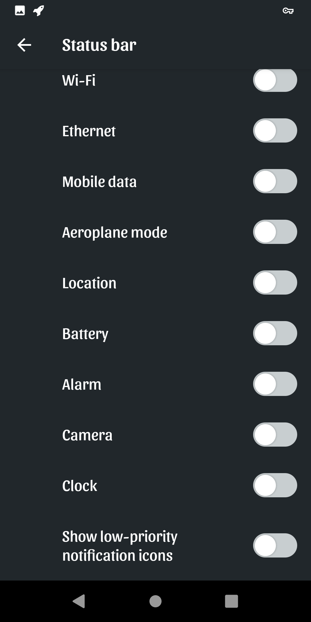
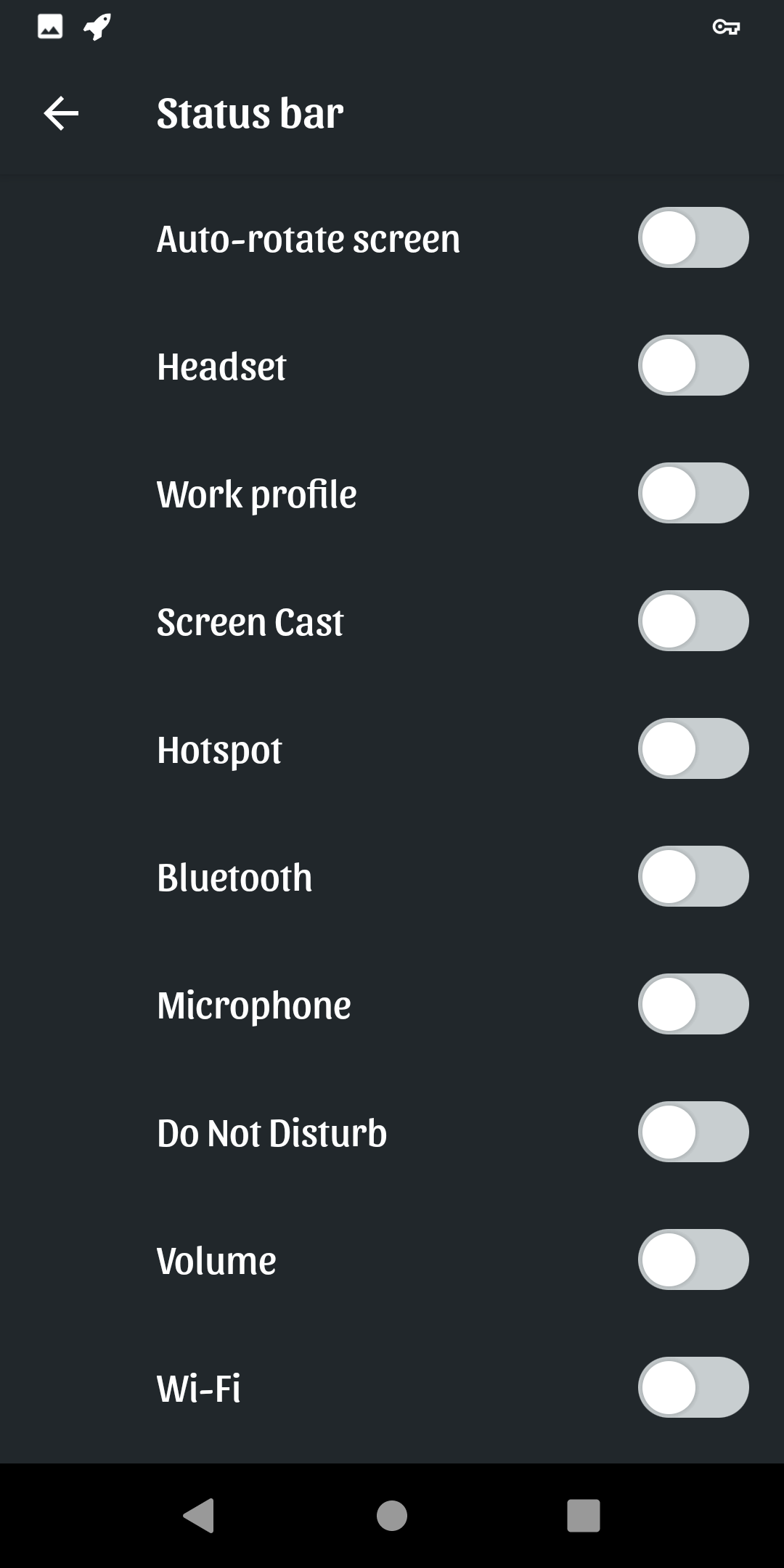
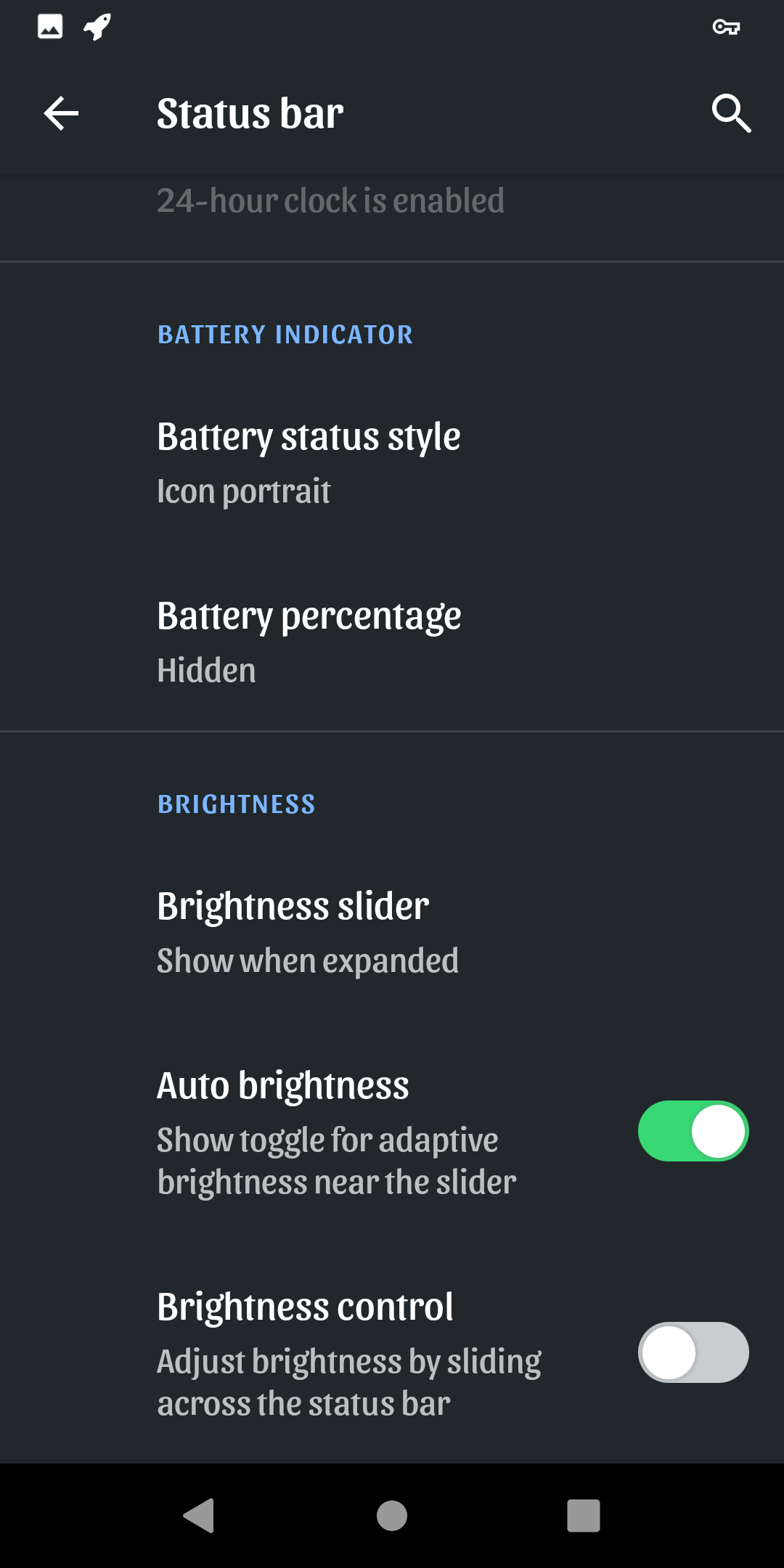
Btw, users could choose whether they want to see battery icon, percentage, both or even hide it; time at the left, right…
Please have a look on how it’s implemented in resurrection remix, it’s really fine. I filed https://gitlab.e.foundation/e/backlog/-/issues/1884
Unfortunately I did not read that post before updating. Does someone know how to switch back to 0.11 (FP3 dev channel)? 0.12 is not usable efficiently this way.
I do not care so much about the status bar and the consistency of colours in the apps.
Being myself not a developer I do not know if these changes are minor or major in terms of labour.
I would prefer improvements in the app functionality - tasks is still unable to sync with DAV or nextcloud in my S8, for example - rather than in these aestethic aspects.
Already done. It’s not working on S8, but working on a tablet S2. The /e/ nextcloud answers that I have to check user and pwd. I’m TOTALLY sure of both.
I already reported both on gitlab and the forum. I have to find some time to investigate further.
Edit. In the meanwhile I had the opportunity to use another nextcloud. The issue in on Accounts, not in Tasks
if you want that people will swap the OS or that moms and dads are feeling good with new OS, it has to look as here ‘old’ OS.
For longer time I have teached our company employees using MS Windoofs and MS office. When MS has swapped the UI to the 'modern look or in Win8 to the pattern I have had support / helpdesk queries as hell
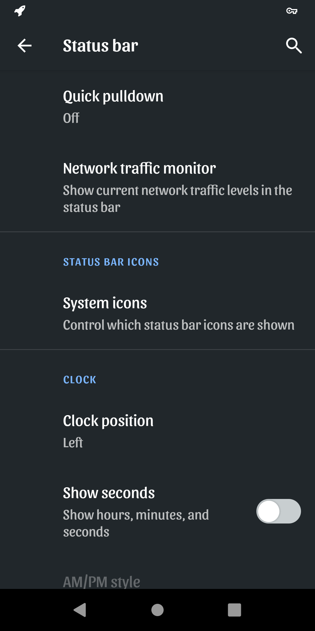
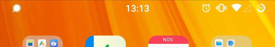
There really is a problem with the traffic monitor. In order to use it, you have to put the clock on the side (because the traffic monitor goes in the middle). But when you put the clock on one side (e.g. left) and enable the traffic monitor, it is displayed on the opposite side (right), but superimposed on the icons there, or without space to them.
We published an update that temporary revert the top bar modification. We will publish an improved version later.
So we can look forward to notification icons returning to our status bars as new builds become available.
As I understand it, the improved version will make the display or not of application icons configurable by an option in settings. So all is (or will very shortly be) good
I have just checkt all standard nav bar options and I really don’t understand why this here us not enough. Was / is this Gui change realky needed? There is nothing you can’t change.
A clarification on the icon-shift-to the left issue. This was a GUI modification meant to give a clean, distinctly /e/ look to the UI. Gaël gave a detailed clarification in his post here.
Now to the important part about the changes getting pushed to the dev branch. This was a slip from the dev team. The fix was added on top of the tested build and released without much testing. Gaël had not approved this neither was this discussed in detail with others in the team. This was a genuine mistake and one that had a serious impact on a large number of users who got the build OTA and attempted to run it on their phones. Not only did the patch cause bootloops it made some users do a factory reset causing loss of their data.
Today we are going to discuss ways to prevent this in future. The no-patches-on-top of a tested build is definitely one of the rules we need to cast in stone. One option I suggested is to have a stable build for all devices. This would be a working build a few iterations older but stable and always available for download. At present we only have stable builds for the phones users purchase from the eShop. These are builds tried and tested in the dev channel.
Also always informing users in advance of major changes and discussing on the forum would be discussed. Most of these are basic requirements in a build release process but in light of these development now they need to be strictly enforced.
i’m still stuck with my device that used to be a phone but is now basically a doorstop that tells me whether or not i have wifi. the update that brought the great improvement of a bootloop was retracted, and so far there is no fix that brings back notifications.
i still am not able to use my phone. i have some patience because i get that some people might not understand why notifications might matter, but imagine i decided that your phone from now on doesn’t ring or vibrate anymore when you get a call. this is my situation now. this with a device i was certified would run with whatever this operating system is supposed to be like.
don’t get me wrong, i could not care less if icons are placed left, right, top or bottom of the screen if i tried REALLY hard. but i need the basic 2009 functionality of a telephone back.
when is this going to happen?