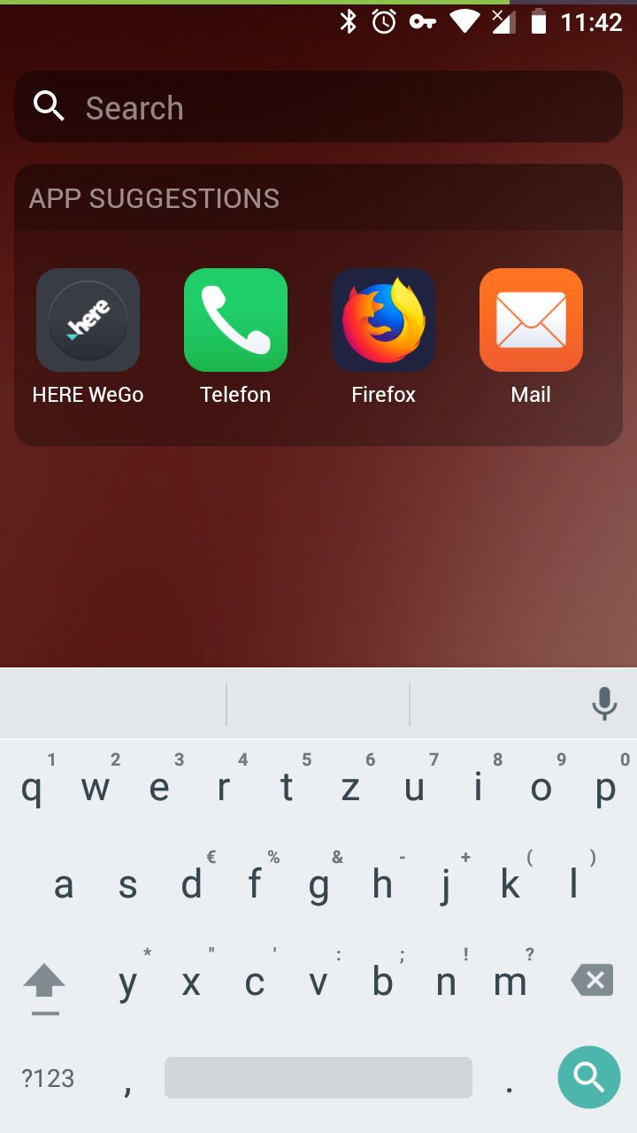
Just saw that Bliss has been updated! There’s a small new thing that I am not so happy with: The new additional Swipe Down Menu for searching.
Now, I have 2 swipe down menus: One (swiping down on the screen) to access search and another (swiping down from the upper edge of the screen) to access Android’s Quick Settings.
That’s too much: Because I can search in the Internet as well by long pressing the home key (o) at the bottom of the screen.
Honestly, I love /e/ because it is just simple (and not overloaded with features). Please keep it simple and add features only if they bring a real added value.
I agree, best would be, to have a settings for Bliss where I can decide what kind of swipe action or so want have. Most launchers does have own settings for background, grid size and so on.
Another simple feature recently added: after returning to Bliss it’s stays on the page the app was on. In my previous version it went back to the homepage which was very annoying. So I love the improvements.
HI @andrelam at al. I did’t say it has to be removed, I only gave my humble opinion.
But let me point out my thoughts in slightly more detailed:
I spent quite some time with my dad (rather older generation), I spent hours with him and his smartphone (not /e/) and I was really astonished in how many situations he detected that the system was actually not-logic in itself. I am just trying to take his observation and appying them to /e/.
But I know so many other users (non digital natives) who really struggle with the functionality overload of so many mobile phone systems.
Call me their devil’s advocate if you want.
I feel, having 2 different swipe down functionalities is probably confusing.
Don’t make it complicated when you can keep it simple.
If a new functionaity is not absolutely necessary, rather offer it as an opt-in feature. That’s why probablly a settings menu for Bliss could be a solution - or transforming one swipe down functionality into a swipe up.
Ok clear, we disagree on this, but that’s o.k. The way i look at it… He would never know this feature because he learned the swipe from the top. I don’t like ton’s of settings. And this new feature is very useful, i don’t have to navigate all the way back to the search screen.
Quick Settings swipe only works if you start from the status bar (upper right or left depending on choice) and does not conflict with Bliss’ swipe which only works in the launcher. I personally don’t see where there can be an issue.

 And that we need lauchner settings
 )
)
