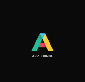
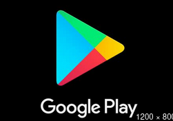
A request to /e/, Murena to please consider changing the App Longe logo.
It’s so similar in colour and shape to the play store logo it’s obviously on purpose but I don’t understand why… the entire purpose of /e/ is to get away from google.
Just looking at the App Lounge logo makes me think ‘google’ straight away, which will be annoying if I see it every time I use my phone.
Would have posted this on Gael’s announcement but that thread is closed.
/e/ 


1 Like
Hmmm, where do most apps in App Lounge come from?
The design of the app logo is a smart way to visualize this.
If you prefer not to have apps from Google Play on your phone, better use
F-Droid

or Aurora Droid

Two app stores with no relation to Google - neither in the logo nor in the available apps.
1 Like
I don’t see a problem, as long as apparently this here is no problem either …


1 Like
How is the letter ‘A’ a similar shape to the Play Store logo. Not even close unless it fell over and filled in. IMO ofc.
When I first saw the App Lounge icon I actually thought of the AuroraOSS logo. Guess we all see things differently.
![]()
