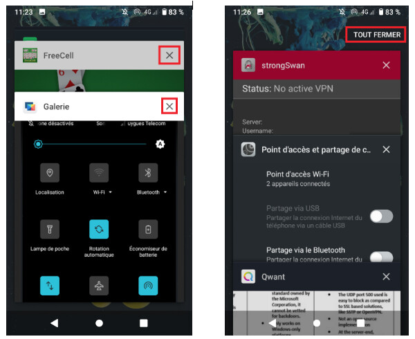
You have always more than one app opened on your device.
When you want to close one or all opened apps, you just have to click on the square at the button right of the screen and all the opened apps appears like below (on the left of the picture):
The stuff which is a little bit annoying after a while is that the cross (surrounded by a red square in the picture above) appears after 2 seconds.
So here, the idea is that cross appears immediately and not after 2 seconds.
In addition, when you want to close all the apps in one action, you have to scroll down all the windows of the opened apps to make appears the button Close All like below above (on the right).
It would be better to locate this button at the bottom in order to have it accessible as soon as you select the square button which show all the opened apps.
Or we can let it at the top but put it on the front of any app displayed. Put this button on the front of any displayed element is really important.
I fully support these ideas. The one I find the most important is, as @MIB said, to locate the Clear all button at the bottom of the screen to make it easier to close all apps. It would make it more convenient to close apps, particularly on devices with large screens for which reaching all the way to the top of the screen is currently necessary.
I would be really interested to know what other members of the /e/ community think of this !
Normally I don’t have many apps open, just one or two. That’s why I tap normally on “Close all” instead of waiting for the “x” to appear. I can’t imagine one good reason for this ridiculous time delay. It’s just obstructive, always, and paternalistic.
Moreover I find this arrangement of stacked apps confusing. When I saw this the first time I thought immediately “What’s that garbage? Damned, now it’s broken.” My opinion is: when they really want to improve the UI and make it more consistent, they should do a complete redesign of this view and get rid of all overlapping.
I fully agree with this proposal. This is one of those features that you dont realize you use alot until you find it missing.
I like how its done in OxygenOS (and probably alot pf other ROMs as well), with a persistent button in the bottom middle of the app switcher, labeled “Clear/Close all”.
first thanks for your replies. @Tryrildoth, I didn’t know that feature. It’s indeed nice but close all apps is also necessary sometime (for me often). If you don’t have the delay on your FP3, there is perhaps a bug for FP3 or my device (Sony Z3 Compact) Perhaps some other users could say if they have this behavior.
@christian.svn, I tried to check on the web and it seems that on OxygenOS, the apps are not displayed down to top but right to left (or the opposite). Am I right?
On my side, I prefer to see all opened apps quickly I would say (so the apps stacked). That depends perhaps also if you have a big screen or not like @anon95995175
Sorry, I didn’t express myself well: I have a delay of 2 seconds between “clicking the square icon in the lower right corner” and “closing icons (= crosses) appear”. But the swipe action can be performed immediately. So if I want to close apps, I use the swipe action, so I don’t have to wait.
On Blackberry 10 the running apps can be displayed in a smaller size, side by side. So you can see all running apps (or as many as fit on a screen) at once, each as big as a postal stamp. The apps can even display a determined content in that size, for instance a time or a battery percentage. And each app has an “x”. No overlapping. I always found this very intuitive.
For the change of the display or running apps, I don’t know what /e/ plan in their roadmap when they say they will work this year on the UX/GUI.
Is it possible to have a comment from /e/ team here?
Would it be possible to have several solution the user could set as he wants (like BB10, from left to right, from bottom to top, …)?
 Perhaps some other users could say if they have this behavior.
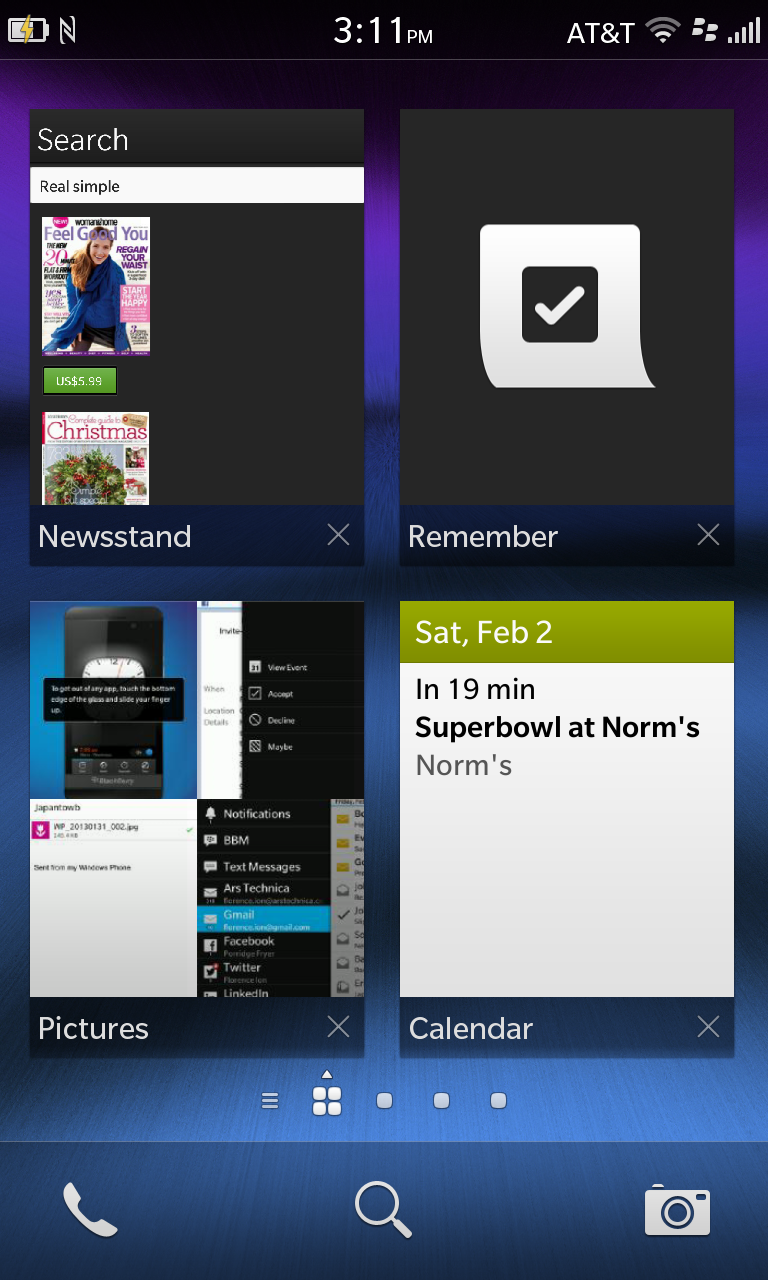