- Vendor Name: Fairphone
- Device name: Fairphone 4
- Device CodeName: FP4
- Version of /e/OS or Stock which existed previously: /e/OS v1.14
- Is the device Rooted / Not rooted: not rooted
Bliss Launcher issues
Seeing a couple of weird Bliss Launcher display glitches. This isn’t necessarily new to v1.15; that’s just when I started to be systematic about investigating and screenshotting.
Dynamic icon shape inconsistencies and glitches
Summary: Bliss Launcher doesn’t respect the user’s choice of dynamic icon shape, except when creating shortcuts. The current shapes gets baked into shortcuts at creation time, even if the user subsequently changes it.
OK, so Bliss Launcher does not respect Settings → Display → Icon Shape for normal app icons. Instead, it always uses “Rounded Rectangle”. I wish it used the setting and allowed you to change the icon shape: squircles are slightly nicer!
When shortcuts are created, though, the shape configured in that setting is respected, but in a weird way. It is hard-baked into the shortcut’s icon for its entire lifetime, then cropped additionally by Bliss’s “rounded rectangle”.
This can make shortcuts display with grey corners, since “Device Default” is “round”, apparently. See the shortcuts created by Shelter in How to make Advanced Privacy work with work profiles using Shelter - #3 by achadwick, and compare them with their equivalents below. I honestly thought that this was how Bliss marked shortcuts, back then, but it turns out it’s just a glitch.
Workaround: If you want consistency between shortcuts and apps, change Settings → Display → Icon Shape to “Rounded Rectangle” before (re)creating the shortcuts
Icon size and layout fluctuations
BlissLauncher’s layout fluctuates over time. Basically, even if the icons stay in the same place and the names don’t change, the layout changes over periods of a few hours or days, and the icons seem to draw unpredictably at different sizes. This misdrawing can (seemingly) compound and make folders display with odd grey bottom and right borders (last screenshot).
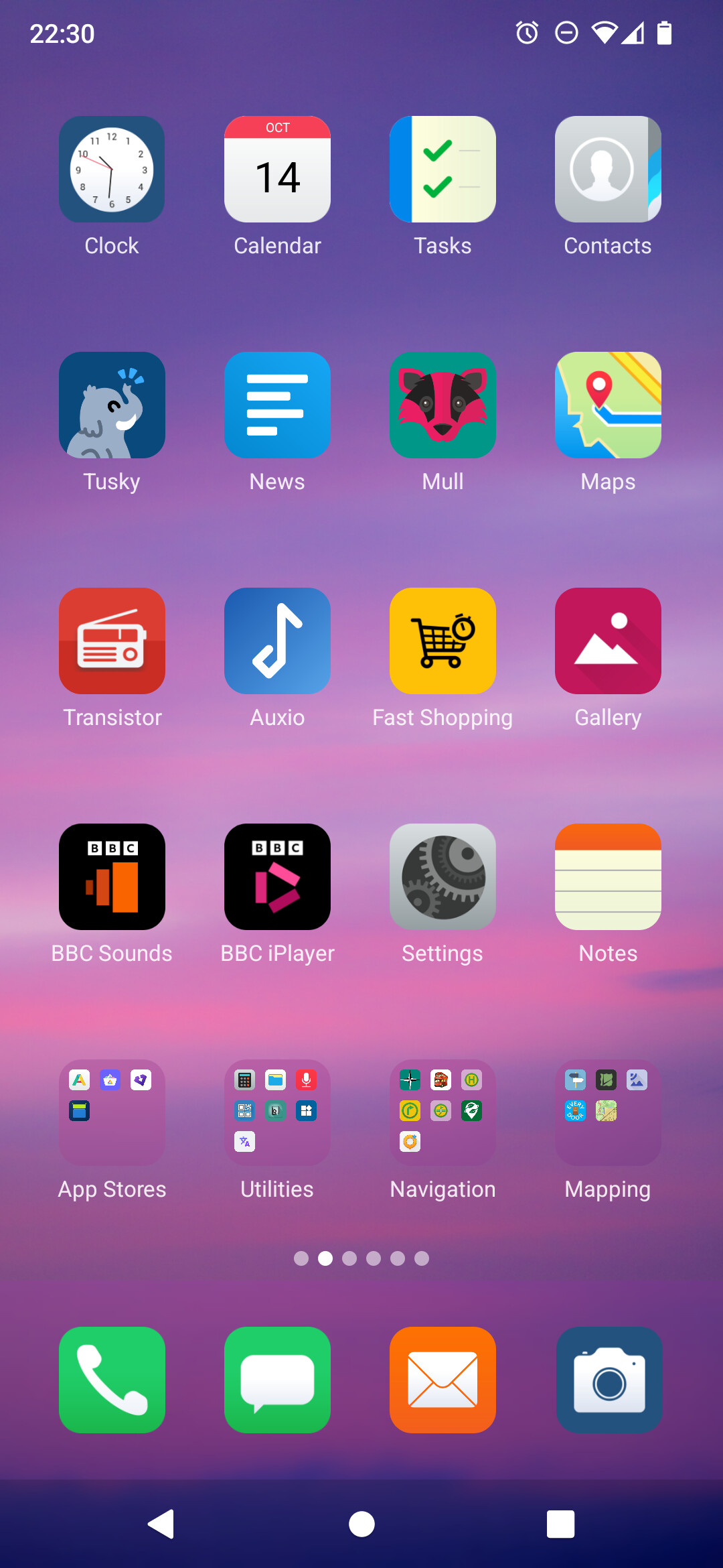
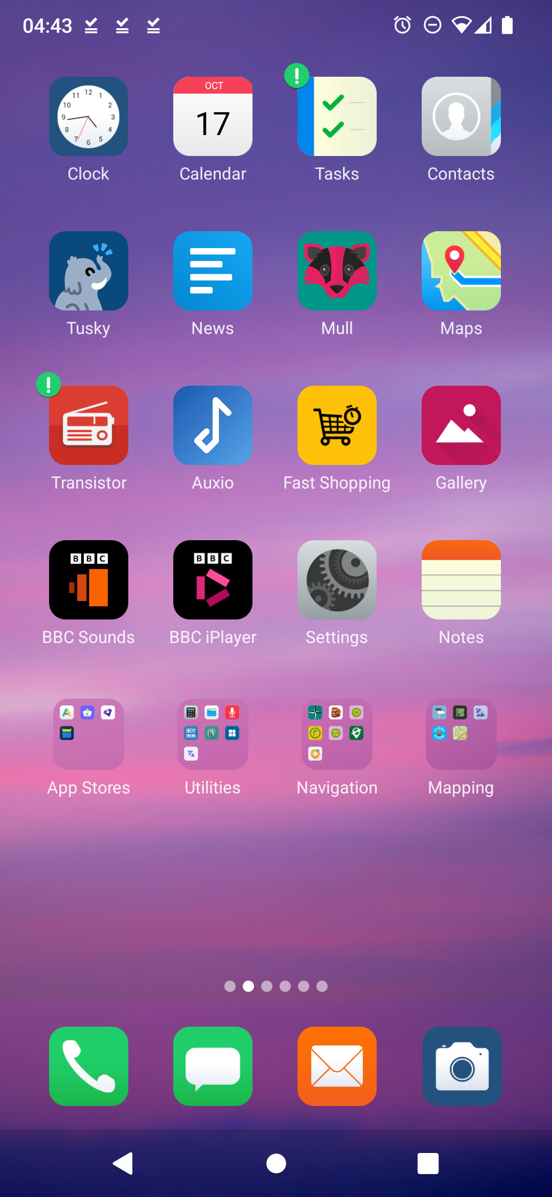
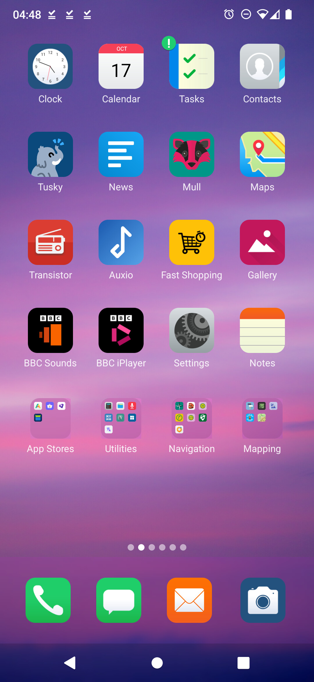
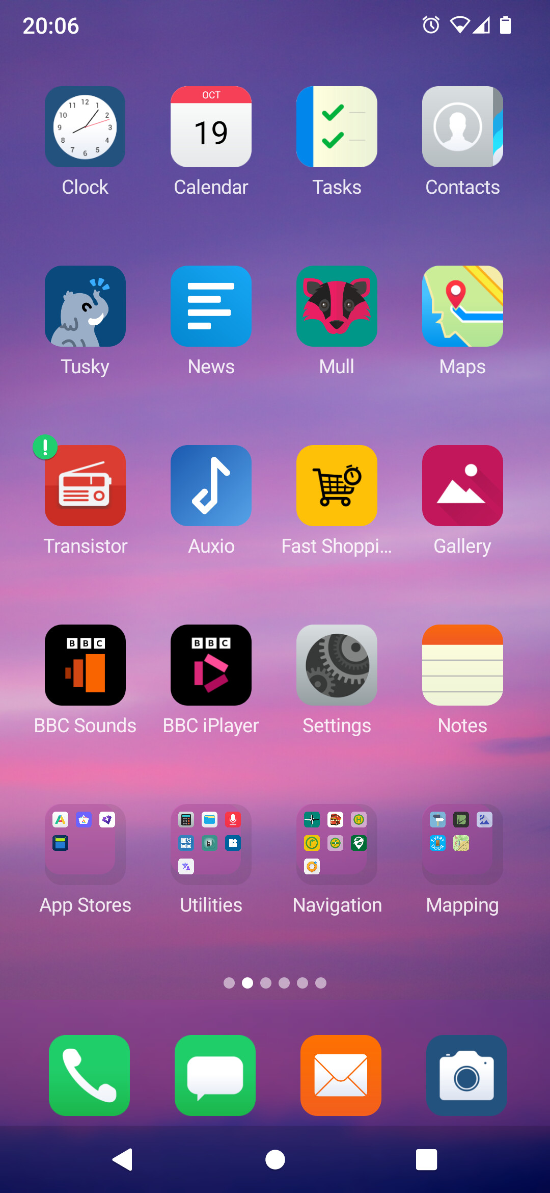
It’s kind of bistable in that the layout algorithm seems to pick one of two sizes for the icons, but the main area and the 4 quick access icons at the bottom stabilize at different times. Which is a bit odd; I wonder if the two zones are influencing each other by adopting different sizes? The screenshots above are ordered chronologically, but aren’t necessarily that close in time (this is over 6 days)
- Main area:
- state M1: screenshots 1 and 4 (nice fill, this looks good)
- state M2: screenshots 2 and 3 (not as nice looking, cant’ really put anything in the gap)
- Quick access strip:
- state Q1: screenshots 1 and 3 (consistent with M1)
- state Q2: screenshots 2 and 4 (small icons like M2)
This glitch affects 3-button, 2-button, and gesture navigation all the same way. The extra space from gesture navigation doesn’t allow the algorithm to make better choices (or more accurately, more consistent and more stable ones)