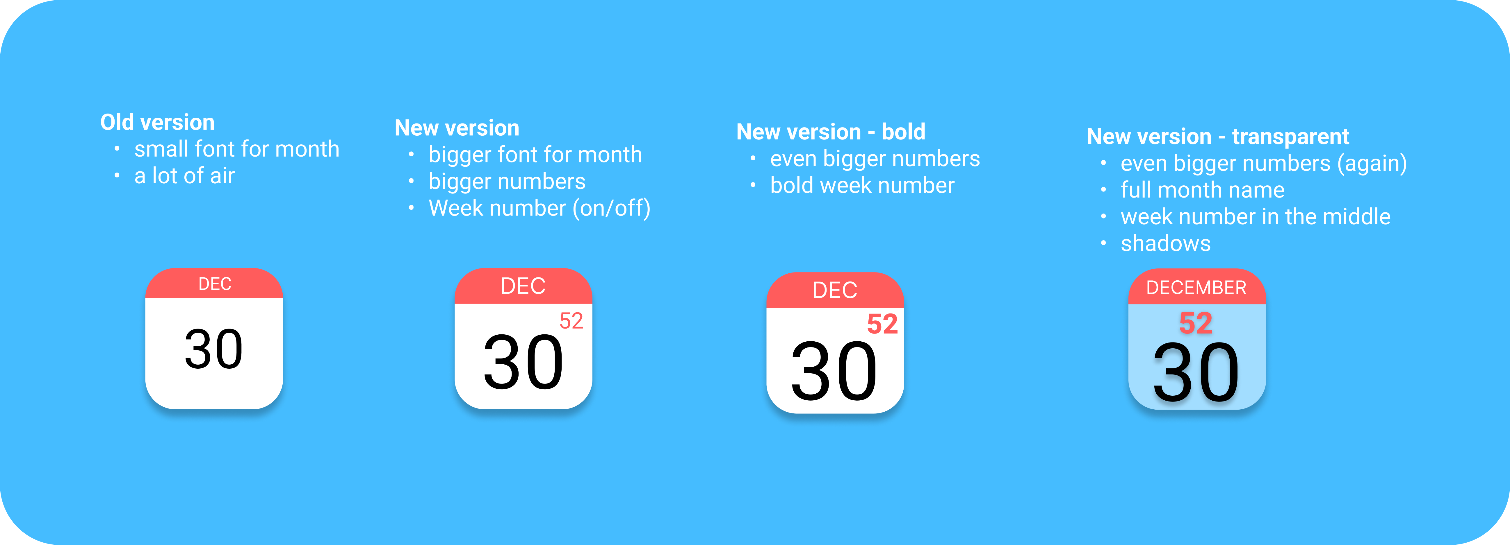
I think the current icon is a bit too minimalist with little functionality. It has a lot of white space and is kind of hard to read on a small screen. A slight adjustment could make it more user friendly ![]()
9 Likes
![]() the week number is a must have !
the week number is a must have !
1 Like
Yes! All hail the bigness!
Ah, there is the month name in the red line.
I had not yet discovered…