/e/OS' user interface is evolving with a new, streamlined, visual identity

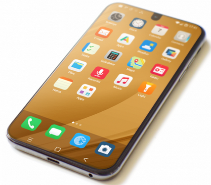
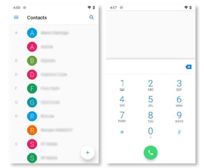
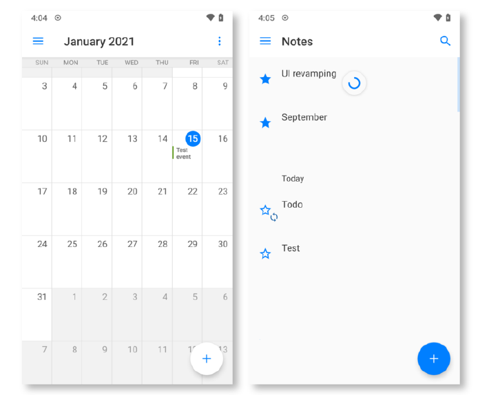
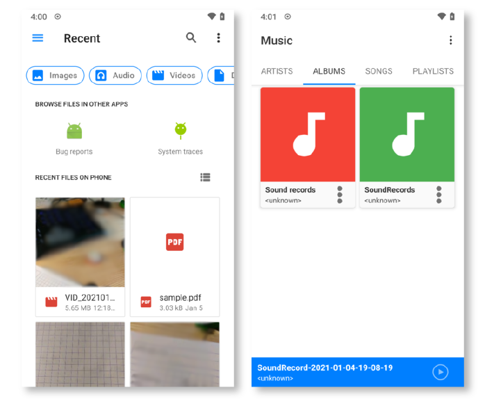
As you know, the open source mobile operating system /e/OS is a fork of the Android Open Source Project, and several open source applications, such as our default apps Etar (calendar), OpenTasks, and QKSMS (SMS) to name a few.

We are overall very satisfied with the functionalities of these software applications, and their contribution to /e/OS. We’d like to take this opportunity to thank the developers and contributors to these projects!

However, the diverse origins of these bricks, which were not designed according to common graphical user interface standards, very often result in a lack of homogeneity between apps and their interfaces, which tends to affect the user experience.

Our needs

We believe it is important for /e/OS to have a consistent visual identity and the best possible user experience for all.

We have therefore the goal of simplifying and streamlining the OS experience as much as possible by unifying the interfaces of our various applications, in order to create a more coherent and harmonious user experience.

We’d also like to continue adding interesting features such as dark-mode or setting themes in the long run.

How we went about it

As a first step in this direction, we have been working for more than a year on graphics, icons, colours and styles, in order to achieve a global and unified vision of our applications.

The resulting mock-ups have been the basis of the visual improvements we are making with this new update.

There has also been in-depth technical work to unify components such as colours and icons used throughout the OS and thus avoid duplication.

Implementation

The new features in this update are the result of an iterative development over several months, enriching and improving the project along the way. It was built around three key moments.

A first experimental version was delivered in October with the aim of gaining a better understanding of how each application at play works and exploring the technical solutions that could be implemented to unify our interfaces.

This version also constituted the first draft of the new graphic interface with the introduction of our accent colour that will be the basis of the new visual identity.

The second development version dates from the beginning of December. It has enabled us to make great progress on the visuals of our interfaces with the definition and implementation of the colours chosen for the /e/OS identity.

The third version from the end of December integrated a new set of icons in order to harmonise the whole OS in this respect.

Since then, we are still hard at work on this long-term project, in order to keep on improving the experience on the OS.

Encountered difficulties

In spite of the complexity of the project, our organisation and our internal communication processes at the development team level enabled us to work through these issues one after an other.

We had the opportunity to use GitLab’s Design Management functionality in order to exchange easily on the implementations.

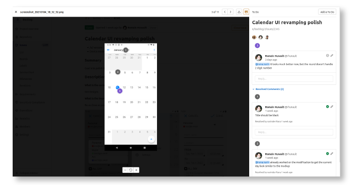
This functionality allows mock-ups and design assets to be uploaded directly into GitLab issues, stored and accessed in one centralized location, which has simplified collaboration between the design team and the engineers developing the interface.

The test phase also has its own constraints, including the time-consuming aspects of developing, compiling, downloading and installing the code.

End results

We are proud to present the results of this work and hope that it will ensure an improved experience on /e/OS.

This update is part of an ongoing visual overhaul project and there are still some points that we would like to unify and integrate in the coming months, such as the email application and integrating a dark mode.

We would like to thank the whole team who contributed to this first chapter of the project, and in particular Mahbub, Amit, Narinder and Mohit.

The updated user interface will be available on /e/ Pie and Q from v0.14.

Read more about what’s new in v0.14 in our release note.

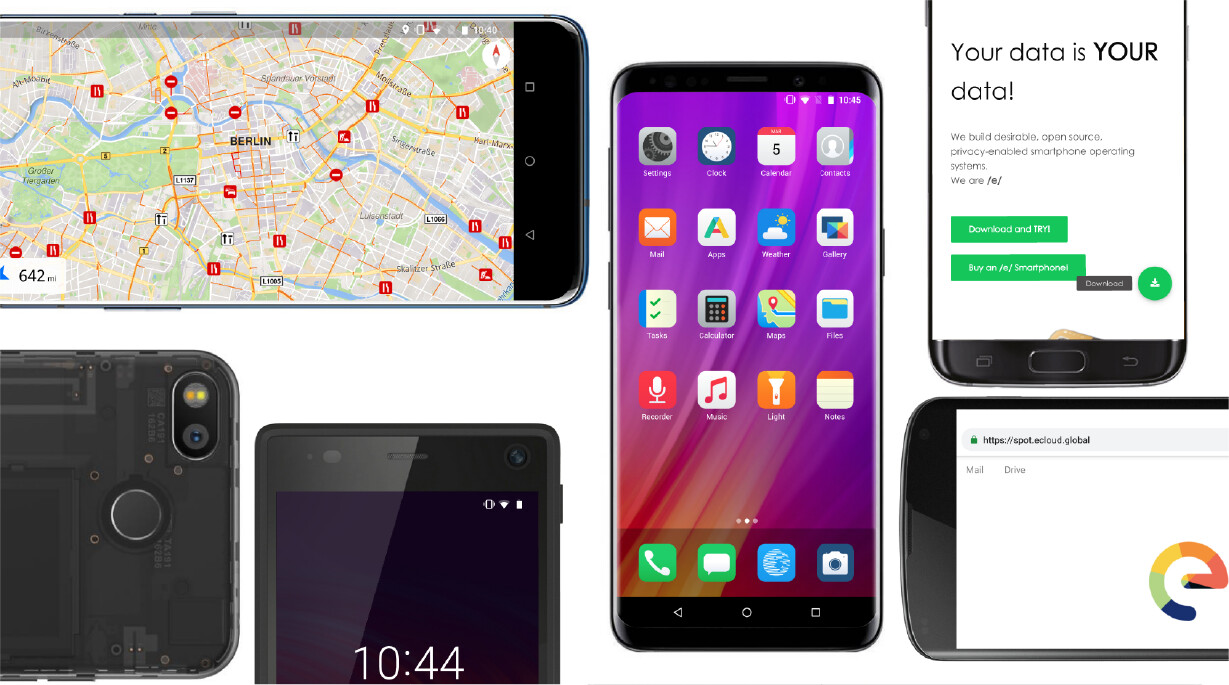
Regain your privacy! Adopt /e/ the unGoogled mobile OS and online servicesphone

16 Likes

Wrong. eOS is a fork of LineageOS and LineageOS is the fork of AOSP

Dark mode still avaiable?

2 Likes

Thanks for the effort!

This update is part of an ongoing visual overhaul project and there are still some points that we would like to unify and integrate in the coming months, such as the email application and integrating a dark mode

it is planned as you can read in the article.

1 Like

I’m kind of confused on the ‘evolving’ interface. I just flashed ‘Q’ on a Galaxy S9 (e-0.13-q-2021012097133-dev-starlte) and it looks, acts, tastes, smells like the same old /e/ interface with some new Lineage bits under the hood.

At least in the last Lineage build I used (17.1), I could delete, remove, place, etc. widgets and app icons wherever I wanted. I appreciate you guys making something like the /e/ ecosystem in the first place, but you’ve got some work to do to even get on the same level of other forks out there.

If Lineage decided to create their own photos/calendar/contacts/docs/etc. ecosystem, /e/ would be toast.

2 Likes

The updated user interface will be available on /e/ Pie and Q from v0.14.

S9 doesn’t have the 0.14 dev image not yet available, just hold out for a bit. I see other devices have it already

I think most of my complaints stem from wanting to see /e/ be a smoother experience all around. I understand most of what goes into it, I just get tired of endlessly fiddling with things, and sometimes I get impatient!

great effort, I was looking forward to it.

Having flipped my hand through the interfaces: the visual similarity is comfortable for the mind. The criticism I can afford is: in a dual-tone interface it’s sometimes hard to identify areas of interactivity and more differentiation is needed, more mid-steps in gray. Similar to the flak microsoft saw for their first iterations on their Flat UI. Making deeper modifications can also make it hard to pull upstream changes.

If you don’t like this about /e/, you just need to install a different launcher. It’s a totally normal Android thing to do.

/e/ deliberately use their own Bliss launcher to simplify things for the supposed target audience, LineageOS deliberately use their own Trebuchet launcher.
If you could install Bliss on LineageOS, you would get the /e/ home screen experience on LineageOS.
If you would install Trebuchet on /e/, you would get the LineageOS homescreen experience on /e/, and you can indeed do this … https://forum.xda-developers.com/t/app-port-lineageos-15-1-trebuchet-laucher-for-any-rom-ver-8-1-0-22.3667436/.

There are tons of other launchers out there, too, which offer what you want.

https://community.e.foundation/search?q=launcher

And yes, I don’t use Bliss myself. I use Lawnchair. But I understand why Bliss exists.

LineageOS isn’t as de-googled as /e/, so there’s still that.

4 Likes

Just updated yesterday and i really like the new gallery design. But also waiting for the darkmode :slight_smile:

by the way, could it be that eOS is getting more and more a iOS UI ??

Nothing wrong with copying good UI. Apple spent loads of money to create good UI. BTW i like eUI better than iOS. That having said, i think the Bliss development takes way too long, still crappy moving around of icons, cant place them where you want… among other anoying things.

I am honestly amazed reading about your efforts on this while there are quite a number of annoying bugs not being fixed for quite a while.

1 Like

I use Nova Launcher. And I don’t understand why Bliss is there. Any ordinary user coming from a phone with stock ROM will expect more from a launcher than Bliss offers. So Trebuchet would be the least to offer in /e/.

3 Likes

I agree with a lot of the comments here regarding to, if you don’t like bliss launcher then you can simply change it, Of course I don’t mean to silence constructive criticism, open source projects rely on the community for feedback and development to improve applications. That is the great thing with it being open source.
Regarding launchers, it’s fun to try out new ones, KISS Launcher is great if you know what you want and what you have on your phone, it’s optimised for speed.
In defence of kiss launcher (which I am currently using, for now) /e/ is aimed at your average end user and is a fork of Lineage which requires more system knowledge. The style of Bliss is deliberately similar to that ios, familiarity is important as is having an /e/ identity, and being uncomplicated.
For example, I wouldn’t give my parents a phone with Lineage installed on it but I would with /e/ out of the box as it is can offer an experience as close to whatever manufacturer ROM they have installed (most people don’t run stock ROMs but whatever comes with their phone from the manufacturer) including stuff like contacts and photos sync if you sign in for the /e/ account.
I realised I have rambled a bit off topic here… :face_with_hand_over_mouth: :upside_down_face:

3 Likes

Is it worth updating to 0.14, which is using this new UI ? As I read in the blog, not all apps have a dark theme. I don’t use many stock apps, only clock and calendar which have a dark mode, so I would be very pissed if I lost that (and the clock app is great I don’t want it to change!!).

Well… I’m not getting OTA upgrade to 0.14 for m’y s9+ (star2lte) running /e/os 0.13 on aosp 10 (q). Is this expected ?

you are running eOS on AOSP ?!?!? could you please explain. eOS is a fork of LOS and LOS is a fork of AOSP. So what do you mean ??

Well. I juste mean I use eos version 0.13 based on LineageOS 17 and thus AOSP 10 (q). But I thought eos 0.14 was out and was somehow expecting an OTA upgrade to pop up after upgrading from Oreo 0.13 to 0.13 q.

This https://gitlab.e.foundation/e/backlog/-/issues/2486 is the “new, streamlined, visual identity”. I totally disapprove the start of a beautification project and thus adding new bugs before the many bugs are removed that are already there.

4 Likes