Hi all,
yesterday I upgraded my fp3+ to 1.9 and pull down menu has large icons now which are not very user friendly. When i go to setting all items there also have huge font size (I had to reduced it font setting). Is ghat intention or bug. It looks ugly and is hard to use.
Thank you

1 Like
That is the design of Android 12. Yes, it’s as I already said ugly, superfluous and unlogic (the button bar at the bottom is crap), but so it has been implemented by Google.
1 Like
I’m keeping tabs on this topic too at Quick Setting / Schnelleinstellunge [/e/OS v1.8] - it’s quite the UI regression. Maybe only power users revolt and it’s all to the benefit of the common user.
Other industries would just claim “due to customer requests” ![]() .
.
Nobody did protest until now, you are the first!
“The Greater Good” ![]() … https://youtu.be/5u8vd_YNbTw
… https://youtu.be/5u8vd_YNbTw
1 Like
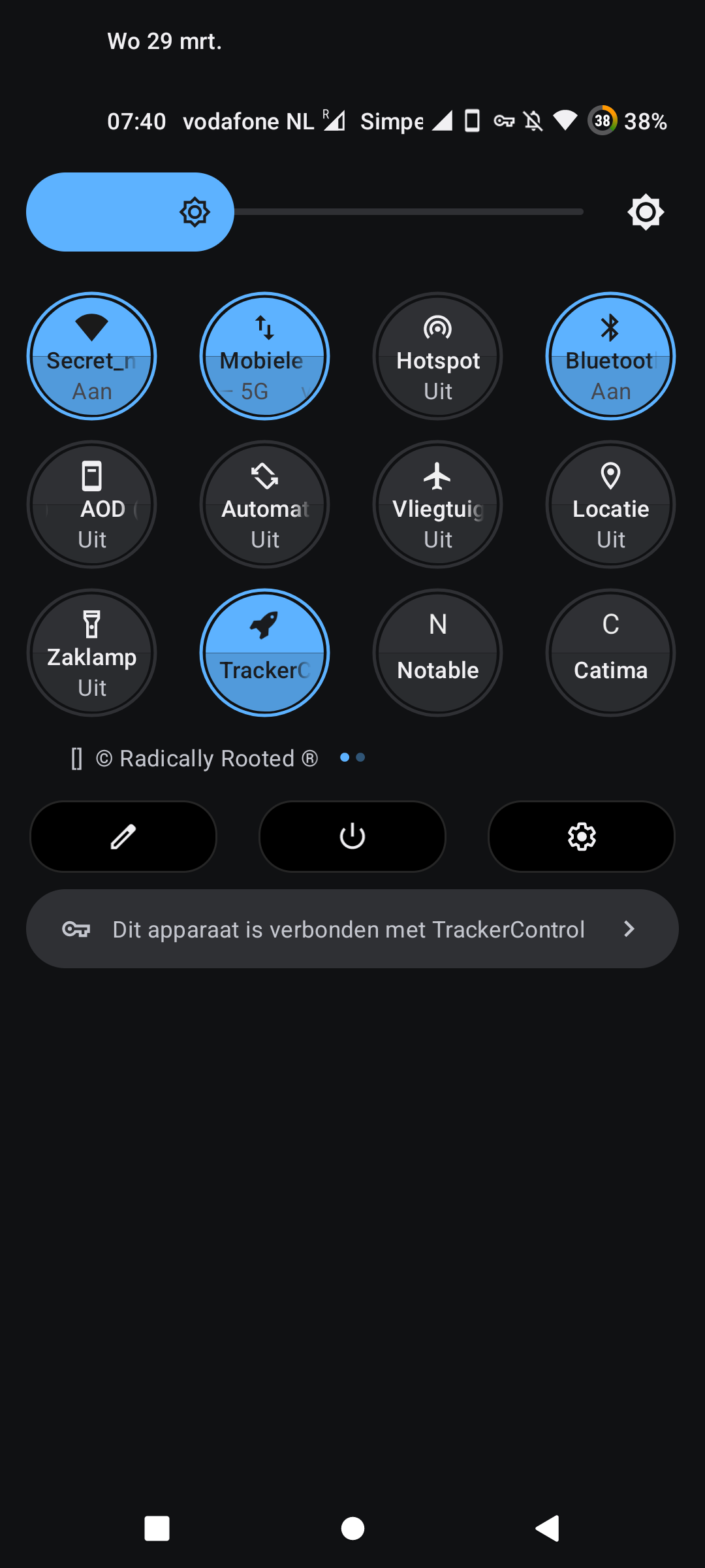
Try AOSP mods. Needs root and LSPosed.
Personally I like the look of Android 11 more than 12
@Infinity thanks, had a look. Things going to be better in Android 16, it’s just a phase.
With AOSP Mods my pull-down menu looks like this. Max. is 4 columns, would have preferred 7. That’s why I have 8 items in the first pull-down and 12 when full. Swipe to the right (no pic) brings me the rest. It’s way better then this stock A12+. That’s so ugly and a waste of space, not to say user unfriendly.
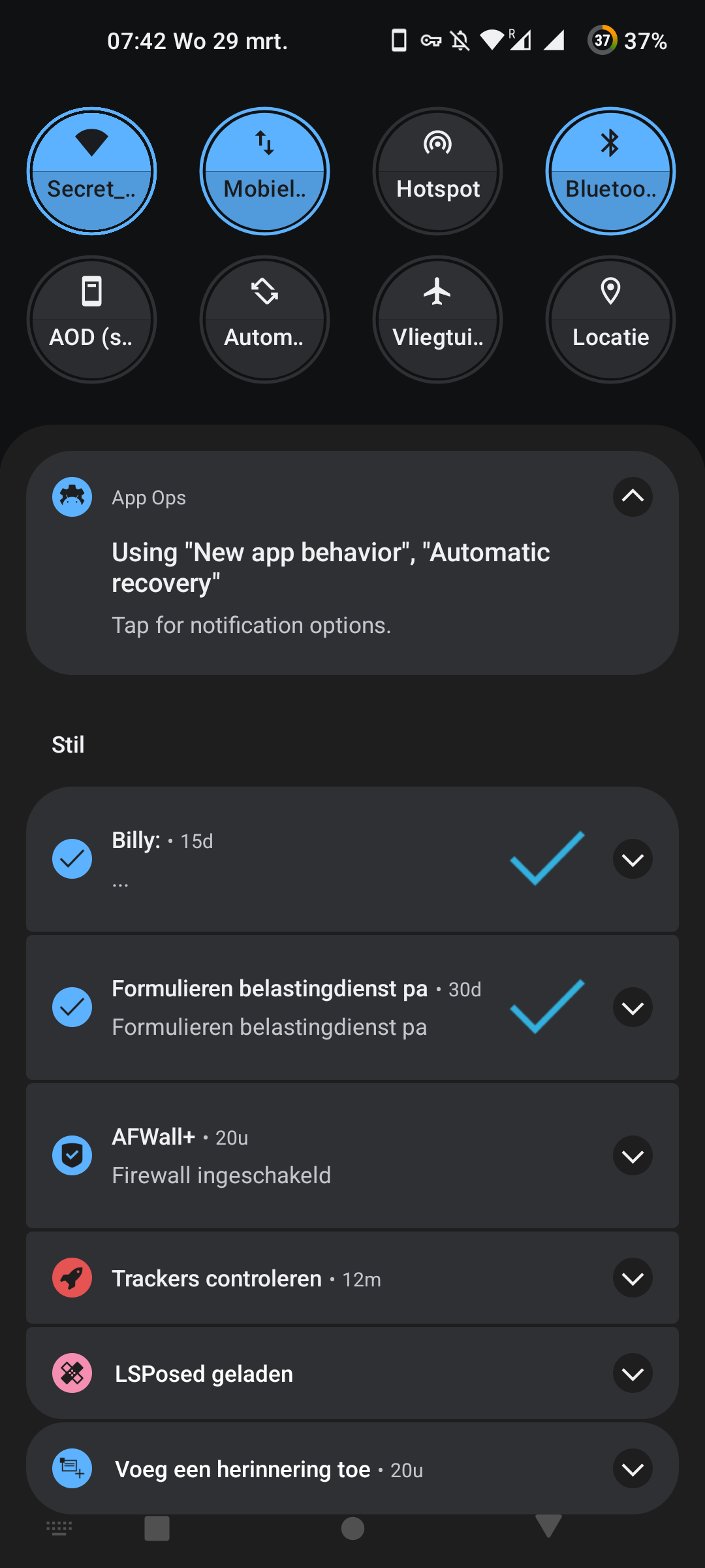
This is the setting on my OnePlus 9 running /e/OS Android 12 version 1.9
1 Like
I hate that you have to click twice to enable wifi or mobile data, but one will get used to it eventually. Maybe every step forward needs 10 steps backward ![]()
I have them seperated, see my setup above. One click does the trick. I added more buttons and switches by the apps Tiles and Tile Extension.
Too bad that GravityBox (even the forked, partially working S-version) doesn’t work when it comes to quick settings.
Customising the quick settings menu the standard way hasn’t changed … pull down the whole menu, tap on the edit pencil icon at the bottom …
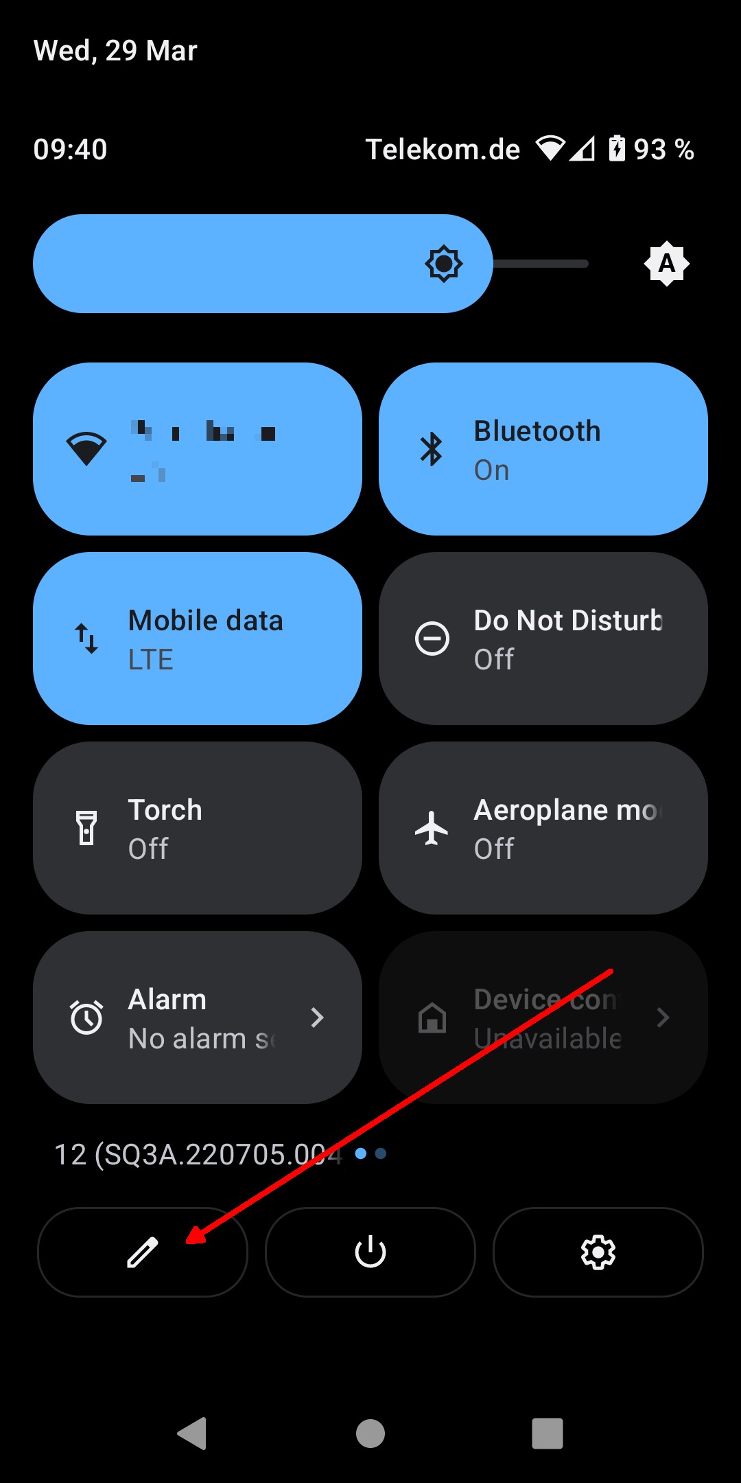
This will show you the whole range of toggles available for the menu, you can just move them into the active menu or remove them from the active menu, separate Wi-Fi and Mobile data toggles are available to replace the combined Internet toggle.
Ahm … I’m also too dumb. Until now I had a button for mobile connection on/off and a button for wifi connection on/off. I don’t get it anymore.
One post above yours ![]() .
.
The problem is here that the top left button is called “WLAN” - OK - but the bottom left button is called “Mobile data” in the selection (the postfix “LTE” is not visible there). So the question is there what about the ordinary mobile connection, GSM, UMTS, LTE or whatever?
I have the button called “Internet” now, this opens a page showing all actual connections, not only Internet, also my provider’s LTE. So this “Internet” is also a crap name. I guess this entire quick settings have been made by a moron with the aim to produce more morons.
This toggle shows the active connection (LTE in my case right now, something else if it’s something else), you just have to pull down the quick settings menu further (swipe down twice) to see the text. Same as with the buttons in Android 11.
I just did what I explained in my post … I edited the quick settings menu in the intended way (which hasn’t changed) and replaced the Internet toggle with the separate Wi-Fi and Mobile data toggles.
Yes but no one tells you. You must guess that.
Yes, but since only 4 mega fat buttons are shown when you do a simple pull down from above a combined button for all the connections is not a bad idea. As long as the buttons don’t get smaller I’ll probably let it this way.
@Infinity @AnotherElk thanks people I noticed that one can still edit it and add/remove icons but i missed that there is one separante for wifi and one for data. I thought they just merged them into one… Oh my day is brighter now
1 Like